
Visualize graphs using BigQuery DataFrames
This document demonstrates how to plot various types of graphs by using the BigQuery DataFrames visualization library.
The bigframes.pandas API
provides a full ecosystem of tools for Python. The API supports advanced
statistical operations, and you can visualize the aggregations generated from
BigQuery DataFrames. You can also switch from
BigQuery DataFrames to a pandas DataFrame with built-in sampling operations.
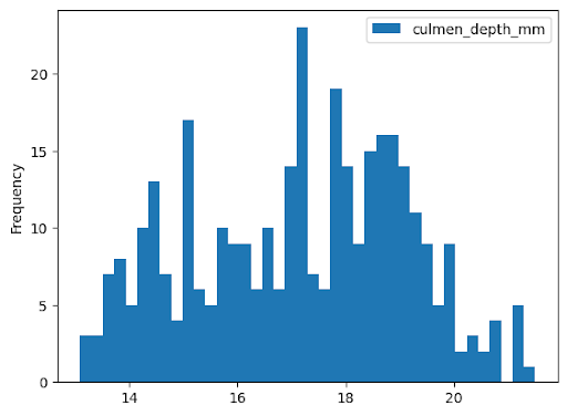
Histogram
The following example reads data from the bigquery-public-data.ml_datasets.penguins
table to plot a histogram on the distribution of penguin culmen depths:
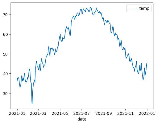
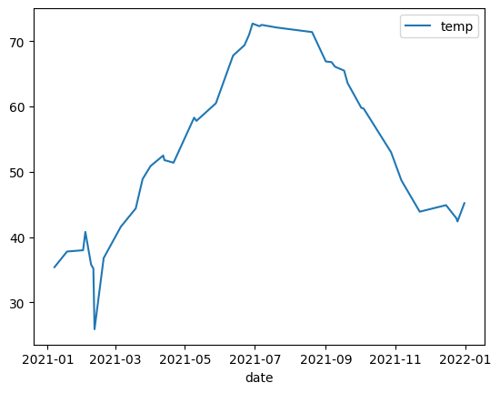
Line chart
The following example uses data from the bigquery-public-data.noaa_gsod.gsod2021 table
to plot a line chart of median temperature changes throughout the year:
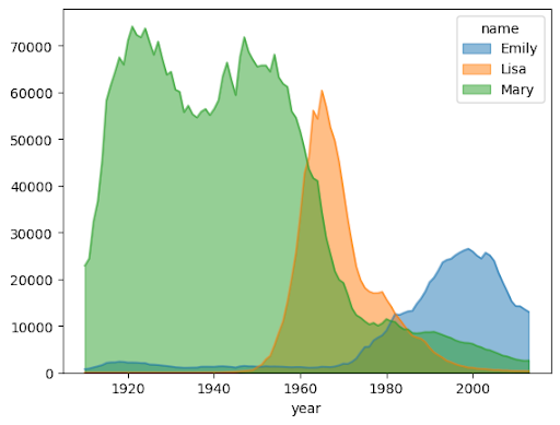
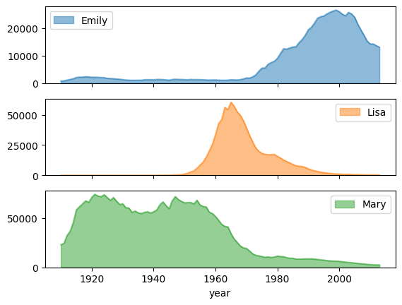
Area chart
The following example uses the bigquery-public-data.usa_names.usa_1910_2013 table to
track name popularity in US history and focuses on the names Mary, Emily,
and Lisa:
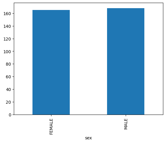
Bar chart
The following example uses the bigquery-public-data.ml_datasets.penguins table to
visualize the distribution of penguin sexes:
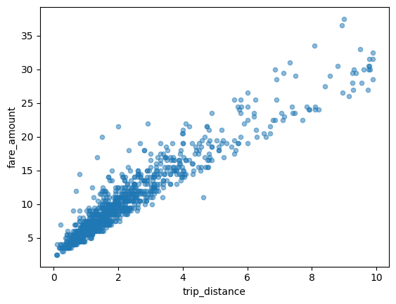
Scatter plot
The following example uses the
bigquery-public-data.new_york_taxi_trips.tlc_yellow_trips_2021 table to
explore the relationship between taxi fare amounts and trip distances:
Visualizing a large dataset
BigQuery DataFrames downloads data to your local machine for visualization. The number of data points to be downloaded is capped at 1,000 by default. If the number of data points exceeds the cap, BigQuery DataFrames randomly samples the number of data points equal to the cap.
You can override this cap by setting the sampling_n parameter when plotting
a graph, as shown in the following example:
Advanced plotting with pandas and Matplotlib parameters
You can pass in more parameters to fine tune your graph like you can with pandas, because the plotting library of BigQuery DataFrames is powered by pandas and Matplotlib. The following sections describe examples.
Name popularity trend with subplots
Using the name history data from the area chart example, the
following example creates individual graphs for each name by setting
subplots=True in the plot.area() function call:
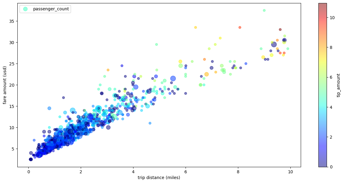
Taxi trip scatter plot with multiple dimensions
Using data from the scatter plot example, the following example
renames the labels for the x-axis and y-axis, uses the passenger_count
parameter for point sizes, uses color points with the tip_amount parameter,
and resizes the figure:
What's next
- Learn about BigQuery DataFrames.
- Learn how to use BigQuery DataFrames in dbt.
- Explore the BigQuery DataFrames API reference.